Carbon Emergency Infrastructures

The following post contains the transcript and images from a talk I gave at the UW-Madison Geography Symposium a couple days ago. Since I wrote the whole thing out, I thought I would go ahead and share it here.


The Carbon Pollution Emergency Act of 2022 has been heralded by historians as the first bold step against global warming taken in the United States. It implemented a heavy carbon tax on all fossil fuels and progressively restricting the amounts of coal, oil, and natural gas that could be produced or imported each year. The Act made it official federal policy to reach 100% renewable electricity generation by 2050. Proceeds of the carbon tax and a reduction in military spending were used provide 90% rebates on small-scale solar and wind energy systems for homes and fund the replacement of fossil fuel electricity plants with wind and solar farms. In the transportation sector, the Act placed a moratorium on the building of new roads and airports and boost funding for mass transit systems by over 1,000%…

 Such a scenario might seem far-fetched today. But not much is invented without imagining it first. Think of all the tablets and cell phones we have now, even 3D printers—all technologies that were dreamed up on Star Trek in the sixties. If we can dream it, we can do it. And I’ve been dreaming. And since I’m a cartographer, my dreams look like maps. The focal point of my dreams up to this point has mostly been the transportation sector, since it’s big, it’s visible, and it entails nifty-looking machines that go “vroom!”

caltrain
Vroom!

I was inspired to share some of my dreams with you by some conversations during the CHE Symposium about the concept of infrastructure, and the question of whether nature can be conceived of as infrastructure. While I don’t see nature as a form of infrastructure, infrastructure does have a large role in shaping nature. This is particularly true of transportation infrastructure, as it has reshaped much of this country’s landscape and is our second-largest source of greenhouse gas emissions, after electricity. So come along and dream with me for the next few minutes about what a transportation future with a lighter carbon footprint could look like.

I want to start here:

Cuba_Hwy
Take a long walk off a short bridge?

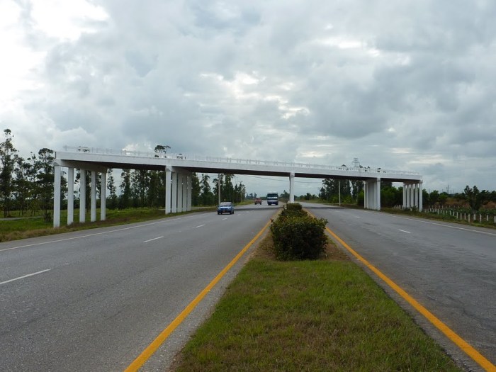
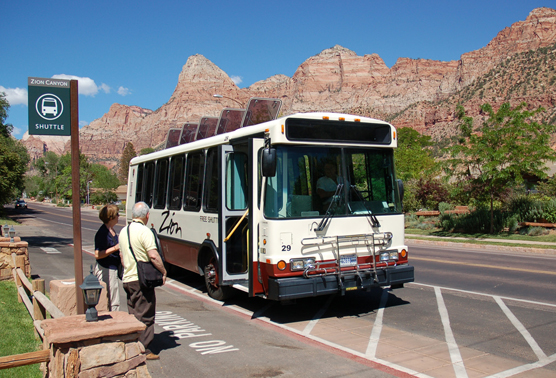
This is the main east-west highway in Cuba. When I visited Cuba in 2005, we traveled part of this highway in a beat-up old school bus. We passed a number of unfinished bridges like this one, along with interchanges with dirt exit ramps leading to nowhere. After the Soviet Union collapsed, Cuba underwent a Carbon Emergency, what they call the Special Period. Overnight, they no longer had an overpaying buyer of their sugar and tobacco exports, so they no longer had money to import fossil fuels. Driving suddenly became very expensive. What you unfortunately can’t see in this picture, and I couldn’t find a good picture of, is all of the bicyclists, pack animals, and hitchhikers that I witnessed making use of the four-lane expressway. While Cuba is slowly being reintegrated into the fossil fuel economy, it still serves as a model for what a post-carbon or largely post-carbon society could look like. And it’s not that bad. The point I want to make here is that this highway is not abandoned, just repurposed. It changed my way of thinking about post-carbon infrastructures. New stuff takes more energy to build, and at least in the near term, that necessarily means it needs more fossil fuels and other non-renewable resources. We shouldn’t necessarily be thinking of how to build shiny new things, but rather how to repurpose the immense and under-cared-for infrastructures we already have to utilize them without fossil fuels.

MadisonRapidTransit_maponly

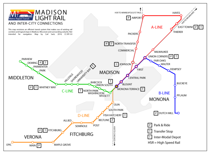
The first cartographic imaginary I created along these lines involved a commuter rail system for Madison. I designed this map over the summer of 2014. Railroads were the first nationwide transportation infrastructure designed to move people and goods quickly over land, so this would be a renewal of an old idea rather than a new idea. At least 60 percent of this proposed urban rail transit network would use existing railroad rights of way.

MadisonRapidTransit2

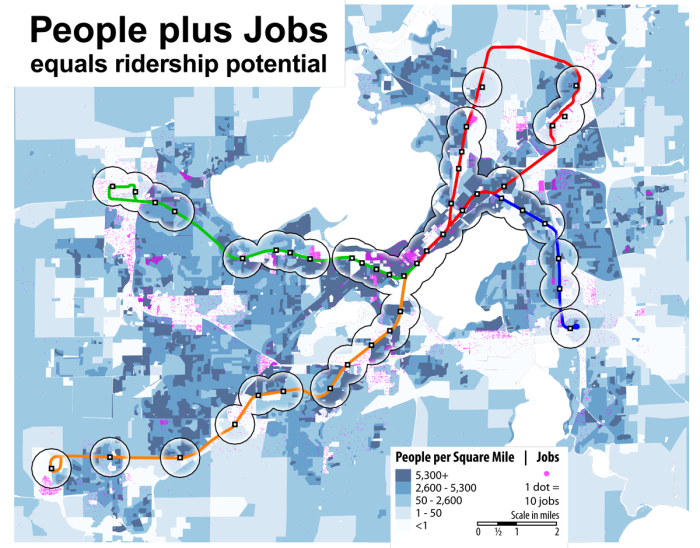
Conducting a bit of GIS analysis, I found that this system would put about 21% of the Dane County population and 47% of the county’s jobs within a half-mile of a station. The system-wide use would be higher still when considering the network of park-and-rides and bus transfer points that would allow it to interface with other forms of surface transportation.

This brings up an important point: the goal of a carbon emergency infrastructure cannot simply be to replace fossil fuel infrastructures, as this is not realistic in the near term. It must interface with them and make it convenient for humans to shift their habits away from heavily consumptive transportation. Imagine how much quicker and easier it would be to take a train from home in Schenk-Atwood or South Park Street to campus than drive a car or cram onto a bus. Young people, old people, and anyone else without a driver’s license would have more freedom to move and more jobs accessible to them. Mass transit is a racial justice issue as well, as those in the black community are less likely to have driver’s licenses than average due to poverty and institutional discrimination. Economists who think about mass transit say that it creates “positive externalities,” or virtuous feedback loops that benefit society at large. One of these is the “Mohring Effect,” the observation that better mass transit service creates more demand, which in turn increases the frequency of service, reducing travel times, creating more demand, and so on.

After completing the urban commuter map, I began to wonder how I might extend a vision for better mass transit outward to rural Wisconsin. Where I went to college, up north, we were fortunate enough to have a regional bus system with one route that ran every two hours on weekdays. This is to say, it was a valiant effort with the very limited funding available, but not very useful to your average commuter. Most parts of the state don’t even have that. I first thought of rebuilding the railroads, as per my Madison transit idea. But the extensive railroad network that used to exist in Wisconsin has largely gone to pot and would cost billions to rebuild. Why not pick up some lower-hanging fruit?

WisconsinBusRoutes
Potential bus routes in northern Wisconsin

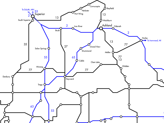
During trips out to the Olympic Peninsula of Washington State, I used their regional bus system, which has more frequent service and quite effectively connects isolated towns across multiple counties. I thought, Wisconsin can do that, and better. So for the past year, in my very limited spare time, I have been working on concocting a transit map with the premise of bus routes with hourly service on every federal and state highway in Wisconsin. This infrastructure uses the road base that already exists, but reimagines it as a more efficient and less deadly people-carrying network. Rides would be pooled onto fast, clean electric buses with professional, sober drivers. Regular bus service, especially in the evenings, would reduce the epidemic of drunk driving in rural Wisconsin, where every burgh has a bar or two and driving is currently the only way to get home. The roads themselves need less maintenance, as fewer cars and trucks create less wear and tear on the pavement. The bus system brings freedom of movement and opportunities for breathing new economic life into the impoverished countryside.


proterra-bus
Get on the bus!

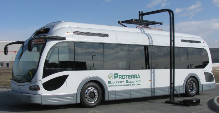
The primary investment needed would be in the moving parts of the infrastructure, the buses. These could be made all-electric using newer battery and fuel cell technologies, or run on cleaner forms of biodiesel, or some combination. They could largely be made out of recycled metals and plastics from decommissioned war machines and old pop bottles and grocery bags. Some nonrenewable resources would still be required.

beach-1170

DevilsLake
Let’s go play in the park!

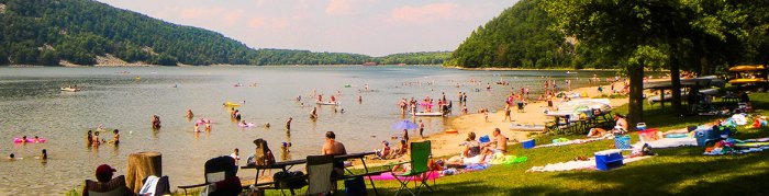
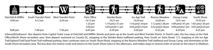
Mass transit need not only be used for commuting to and from employment. Recreation has a place in our imaginaries too. And like access to jobs and other privileges that come with mobility, access to recreational and relaxation opportunities can and should be enhanced by mass transit. With a relatively small grant, the City of Madison could begin offering round-trip service to nearby state parks on summer weekends, making these oases accessible to young people and low income folks who can’t afford the gas and the park entry fee.

npbus
Passengers board a shuttle bus in Zion National Park. National parks provide shuttle buses to alleviate automobile congestion and reduce air pollution.


In this imaginary, city buses not in use during the more limited weekend service routes would be driven by Metro drivers who want to earn overtime pay while enjoying some time away from the city themselves. The buses begin from downtown, stopping at outlying transfer points for greater convenience, and spend the day traveling to and around the recreation area before returning home in the evening. From Madison, Parkbus routes could service a number of parks and recreation areas within an hour’s drive on different weekends throughout the summer, including Devil’s Lake, Blue Mounds, Governor Dodge, Kettle Moraine State Forest, and Wisconsin Dells. Service to the same area on both Saturday and Sunday facilitates overnight campouts. Urban citizens have the opportunity to relax and rejuvenate in nature without having to drive there. The most crowded parks, like Devil’s Lake and Governor Dodge, no longer have to contend with paving over more of their land as parking lots, and their air is cleaner too, all because urbanites have the option of taking the bus instead of driving.

IBX

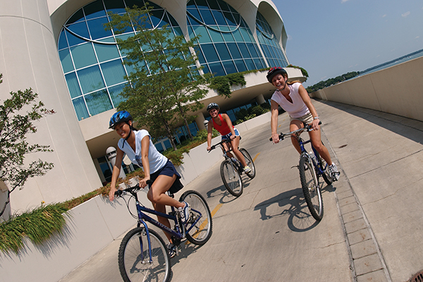
To close, I want to take us back home to Madison and consider the one form of wheeled transportation that is closest to being carbon-neutral. That, of course, is biking. Madison is already a great place to commute by bicycle. It is currently ranked the 7th-most bike friendly city in the U.S. by Bicycling Magazine. On the other hand, we’re 7th, just behind hill-infested San Francisco! Madison can do better!

Tourism_MononaTerrace
Cyclists ride past Monona Terrace on the Capitol City Bike Path. Image from Shifting Gears, Wisconsin Historical Museum

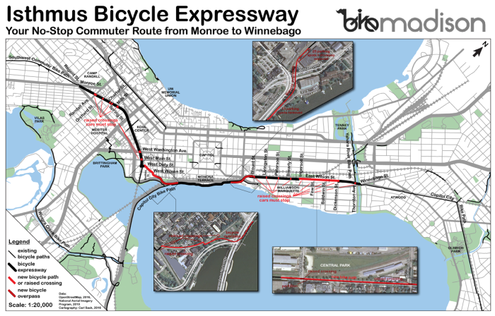
One way to encourage more bike commuting is to improve existing commuter routes while reducing the convenience of driving. The most heavily used bike corridor in Madison, the Capitol City Path across the Isthmus, sees close to a thousand cyclists a day on average during peak season. But it requires frequent stops for cross-traffic on very minor streets, as well as tedious and dangerous crossings of two of the city’s busiest intersections. To get to campus that way, you have to go out of the way along Monona Bay before turning north. On my own commute to campus from the East Side, rather than deal with this detour, I ride Gorham and Johnson streets, which have very heavy car traffic and are downright treacherous in winter. But what if the existing bike corridor were re-envisioned as a “no-stop zone” for bikes, the nation’s first bicycle expressway? Think about the new raised pedestrian crossing on Park Street at the end of Library Mall. Why can’t such crossings be added to the existing bike path to give cyclists a smoother ride? On local streets, cars should be made to stop for bikes instead of the other way around. A cut-through bike path could be constructed alongside the train tracks that cut the corner from Broom Street to West main.

IBX_south_bridgeIBX_north_bridge

IBX_wilson_st

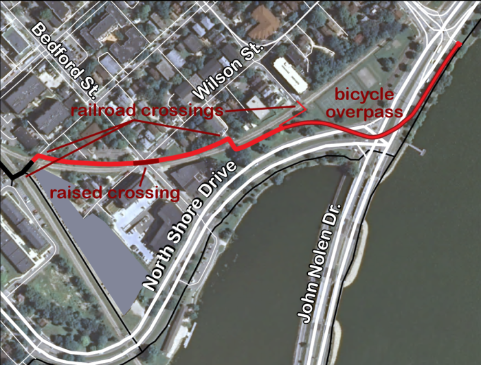
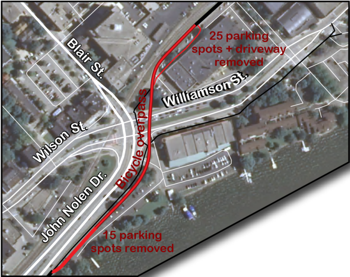
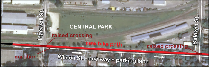
Two new bicycle overpasses would carry cyclists quickly and safely across John Nolan Drive at North Shore and across Williamson Street at the Blair/John Nolan intersection, as well as a reconfiguration of the current “bike boulevard” along East Wilson Street to put bikes in a partitioned express track.


First-Settlement-Park-Overview
Plans by the Madison Design Professionals Workgroup for a covered-over Blair Street/John Nolan Drive

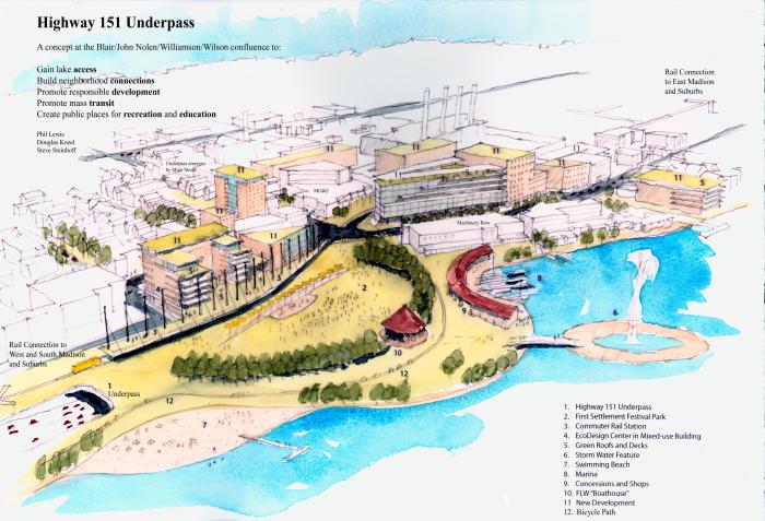
It turns out I am not the only person thinking about such things. The Madison Design Professionals Workgroup recently put forward a proposal to cover up John Nolan Drive to improve local pedestrian, bike, and rail connections between downtown and the Isthmus. Their plan is driven more by aesthetics than sustainability and would use a lot more nonrenewable resources, but does incorporate bicycle and commuter rail components. It could easily include my vision for a bike expressway (and if the designers are smart, I think they will). Of course, this plan is much more thought out than mine, and by people who actually get paid to do this stuff. To date, all of my doodling has been stuff I’ve daydreamed in my spare time. But who knows? Even daydreams can sometimes make their way into the world.

Printing in Leaflet

It’s been a while since I posted anything to this blog, but that doesn’t mean I haven’t been busy. I’ve been having all kinds of adventures working with Leaflet and making it do interesting things it probably wasn’t intended for. I’ll try to catch up with writing about some of these over the next few posts.

My most recent triumph involves printing a Leaflet map. Now, I know what you’re going to say: Why would you print a Leaflet map? Aside from the snarky answer why not?, the project I’m working on requires a map that is both interactive and can go where there are no mobile devices or internet access, and that requires printing.

Before I get into the technical stuff, I want to briefly expound on the broader implications of what I’m about to cover. We in the cartography world are generally split down the middle when it comes to media: either you make static maps for print or you make interactive web maps. Generally, the only crossovers are static maps that get plopped online Web 1.0-style, as images or PDFs. I think it’s high time we start thinking about transcending these media silos with our maps. Like, can you print an SVG graphic generated by D3? Sure you can, but can you control the scale at which it prints and make it look good? Similarly, how do we make zoomable, panable slippy maps, with all the advantages those entail for web users, and make them printable as a resource for those who need to draw on top of them or pick them up and take them where reliable internet access doesn’t exist?

The specific map I’ve been working on for a little over a year now is wikimap of data collected in eastern Senegal, which will enable trusted users with local knowledge to edit the data and contribute new data. One of the requirements of the application is that it be printable as posters to take to village meetings. The map utilizes an underlying satellite imagery tileset, a custom tileset with the polygon and line data (hosted with Tilestrata on Amazon AWS, which is a whole other blog post waiting to happen), and the point data as overlays added with your typical L.geoJson calls.

Screenshot1.png
Couloirs Transhumance,
a map of herding routes in eastern Senegal

One challenge is that the map covers such a huge geographic area and includes so much data that a printed version of the entire thing would be unintelligible unless printed on a very large poster. Thus, users need to be able to choose both the scale of the map they print and the paper size, and they need to be able to preview what they’re going to print. So I built a print preview window.

Screenshot2_crop
Teh Printerface!

First of all, notice there are no satellite image tiles on the map. Satellite images are basically photos (but from spaaaaaaaace). Have you ever tried printing a photo at 72 dpi? It looks. like. crap. Likewise, raster tilesets look like crap when printed. Ditch ’em.


But I still wanted to take advantage of Leaflet’s smooth interaction capabilities to allow the user to control the map view that they’re going to print. Thus, I created a new Leaflet map with no base layer and L.geoJson overlays for all of the mapped data, including the two-dimensional features that are burned into my custom tileset on the main map. When there are thousands of SVG paths and raster icons on the map, it slows things down a bit. So I had to kill scroll wheel zoom and get the zoom buttons off the map anyway, since they’re not going to be present on the final printout. Hence the scale bar, which represents the Leaflet zoom levels as tics on a line to give users an idea of how close they are to the minimum or maximum zoom.

You’ll notice that under the scale bar is an actual, honest-to-godess ratio scale, which applies to the printed map. Okay, so there’s like, A LOT of math behind this, because the map scale varies based on latitude, zoom level of the map, page size, and the size and shape of the preview window. Here’s the code:

function adjustScale(){
    //change symbol sizes and ratio scale according to paper size
    var prevWidth = $("#printPreview").width();
    var prevHeight = $("#printPreview").height();
    var longside = getLongside();
         
    //find the mm per pixel ratio
    var mmppPaper = prevWidth > prevHeight ? longside / prevWidth : longside / prevHeight;
    var mapZoom = printPreviewMap.getZoom();
    var scaleText = $("#printBox .leaflet-control-scale-line").html().split(" ");
    var multiplier = scaleText[1] == "km" ? 1000000 : 1000;
    var scalemm = Number(scaleText[0]) * multiplier;
    var scalepx = Number($("#printBox .leaflet-control-scale-line").width());
    var mmppMap = scalemm / scalepx;
    var denominator = Math.round(mmppMap / mmppPaper);
    $("#ratioScale span").text(denominator);
    $("#previewLoading").hide();
    return [mmppMap, mmppPaper];
};

function getLongside(){
    //get longside in mm minus print margins
    var size = $("#paperSize select option:selected").val();
    var series = size[0];
    var pScale = Number(size[1]);
    var longside;
    if (series == "A"){ //equations for long side lengths in mm, minus 10mm print margins
        longside = Math.floor(1000/(Math.pow(2,(2*pScale-1)/4)) + 0.2) - 20;
    } else if (series == "B"){
        longside = Math.floor(1000/(Math.pow(2,(pScale-1)/2)) + 0.2) - 20;
    };
    return longside;
};

What the printerface does is give the user access to all of these variables, and change the map scale depending on them. Fortunately, international paper sizes greatly simplify this math by maintaining the same aspect ratio (√2) regardless of size. If the window size changes, the preview map can change size proportionally and still represent the printed page. In order to better represent what the printout will look like, the ratios allow for automatically adjusting the size of the symbols on the map based on the window size or chosen paper size. So if the user changes the paper size to, say, A1 (a typical poster size), the preview map looks like this:

Screenshot3_crop.png

Note that the ratio scale has increased quite a bit. Think about what this will look like when it turns into a 841 mm x 594 mm poster. The bounding box has been preserved, symbols will be the same proportions relative to each other as in the preview, and they will be the same absolute size as the symbols printed on any other page size (8 mm wide for the icons). Also note the new labels for village features. These are scripted to show up whenever the scale is greater than 1:250000. More on these in a minute.

The last tricky step to printing is how to actually resize everything so everything on the map prints at the right size with the correct bounding box. Folks, I’m here to tell you, figuring this out was no walk in the park. I may have prematurely lost some hair over it. In the end, the solution was as simple yet un-straightforward as the cheat that lets you beat Myst within the first five minutes (for you whipper-snappers, that’s a shameless 90’s computer game reference). Here’s the code in case you want to pick through it; if you just want the punch line, skip on down.

$("#printButton").click(function(){    

    //transform map pane
    var mapTransform = $("#printPreview .leaflet-map-pane").css("transform"); //get the current transform matrix
    var mmpp = adjustScale(); //get mm per css-pixel
    var multiplier = mmpp[1] * 3.7795; //multiply paper mm per css-pixel by css-pixels per mm to get zoom ratio
    var mapTransform2 = mapTransform + " scale("+ multiplier +")"; //add the scale transform
    $("#printPreview .leaflet-map-pane").css("transform", mapTransform2); //set new transformation

    //set new transform origin to capture panning
    var tfMatrix = mapTransform.split("(")[1].split(")")[0].split(", ");
    var toX = 0 - tfMatrix[4],
        toY = 0 - tfMatrix[5];
    $("#printPreview .leaflet-map-pane").css("transform-origin", toX + "px " + toY + "px");

    //determine which is long side of paper
    var sdim, ldim;
    if ($("#paperOrientation option[value=portrait]").prop("selected")){
        sdim = "width";
        ldim = "height";
    } else {
        sdim = "height";
        ldim = "width";
    };

    //store prior dimensions for reset
    var previewWidth = $("#printPreview").css("width"),
        previewHeight = $("#printPreview").css("height")

    //set the page dimensions for print
    var paperLongside = getLongside(); //paper length in mm minus 20mm total print margins minus border
    $("#printPreview").css(ldim, paperLongside + "mm");
    $("#printPreview").css(sdim, paperLongside/Math.sqrt(2) + "mm");
    $("#container").css("height", $("#printPreview").css("height"));
    
    //adjust the scale bar
    var scaleWidth = parseFloat($("#printBox .leaflet-control-scale-line").css('width').split('px')[0]);
    $("#printBox .leaflet-control-scale-line").css('width', String(scaleWidth * multiplier * 1.1) + "px");
    $("#printBox .leaflet-control-scale").css({
        'margin-bottom': String(5 * multiplier * 1.1) + "px",
        'margin-left': String(5 * multiplier * 1.1) + "px"
    });

    //adjust north arrow
    var arrowWidth = parseFloat($(".northArrow img").css('width').split("px")[0]),
        arrowMargin = parseFloat($(".northArrow").css('margin-top').split("px")[0]);
    $(".northArrow img").css({
        width: String(arrowWidth * multiplier * 1.1) + "px",
        height: String(arrowWidth * multiplier * 1.1) + "px"
    });
    $(".northArrow").css({
        "margin-right": String(arrowMargin * multiplier * 1.1),
        "margin-top": String(arrowMargin * multiplier * 1.1)
    });

    //print
    window.print();

    //reset print preview
    $("#printPreview .leaflet-map-pane").css("transform", mapTransform); //reset to original matrix transform
    $("#printPreview").css({
        width: previewWidth,
        height: previewHeight
    });
    //reset scale bar
    $("#printBox .leaflet-control-scale-line").css('width', scaleWidth+"px");
    $("#printBox .leaflet-control-scale").css({
        'margin-bottom': "",
        'margin-left': ""
    });
    //reset north arrow
    $(".northArrow img").css({
        width: arrowWidth + "px",
        height: arrowWidth + "px"
    });
    $(".northArrow").css({
        "margin-right": arrowMargin,
        "margin-top": arrowMargin
    });
});

Okay, here’s the punchline. The key is using a CSS transform to temporarily scale up the whole leaflet-map-pane div, which holds all of the layers in the print preview map. Leaflet already adjusts the symbol positions using a transform translation, and I need to preserve that transform to reset the map after it’s printed. But to print it, I need to add a scale transform that multiplies the size of everything by the ratio of paper millimeters per screen millimeter (which you get if you cross-multiply paper mm per pixel times pixels per screen mm). Once I figured this out, I had to figure out how to adjust the transform origin so the bounding box didn’t move out from under my paper map. This involved dissecting the transform matrix and turning the last two numbers negative as the x and y coordinates of the transform origin, which moves the whole map back up and to the left, where it should be (I still can’t keep straight why this works even after re-reading the above link, but I’m sure you mathy people can figure it out).

The rest of the above code just messes with the map div and the accessory elements to get them all the right print size, pulls the trigger, then sets everything back right for the screen viewer. Oh, I also have some helpful print CSS styles, which I’m not going to bother explaining:

@media print {
    @page {
        size: auto;
        margin: 10mm;
    }

    body {
        /*border: 5px solid blue;*/
    }

    #container {
        /*border: 4px solid green;*/
        position: absolute;
    }

    #cover, #maparea, #printOptions, #ppmmtest, .closeDialog, .resize, .msg_qq {
        display: none !important;
    }

    #printBox, #printPreview {
        position: absolute;
        bottom: 0;
        left: 0;
        top: 0;
        right: 0;
        /*border: 1px solid red;*/
    }

    #printPreview {
        border: 1px solid black !important;
        background-color: white !important;
    }

    #printPreview span {
        text-shadow: -1px -1px 0 #FFF, 1px -1px 0 #FFF, -1px 1px 0 #FFF, 1px 1px 0 #FFF;
    }

    .leaflet-control-scale-line {
        text-align: center;
    }
}

So yeah, that’s printing from Leaflet in a nutshell. Just to prove I’m not blowing smoke, here’s a scan of the printed version of the second screenshot of the post.

scan.png

Pretty good, huh?

Now, I promised you I would talk about labels. Leaflet and labels are like Cowboy and Octopus. After all, why would you need to put labels on a Leaflet map when they’re baked into your tiles? Well, again we come to this minor issue of printed raster tiles looking like something a dung beetle would enjoy. So I needed to figure out how to plunk labels onto my map. For the area features, which are drawn as SVG overlays, I decided the easiest thing would be to just add the labels as SVG <text> elements, placing them in the center of each feature’s bounding box. Unfortunately, I’ve found that once Leaflet draws its overlays, you can’t just put new elements into the SVG and expect them to render. So I cheated a little and brought in D3 to do the job. Because D3 is magic.

//for SVG polygons, add label to center of polygon
var g = d3.selectAll('#printPreview g'),
    scaleVals = adjustScale(),
    denominator = Math.round(scaleVals[0]/scaleVals[1]),
    areaTextSize = denominator > 500000 ? '0' : String(8/scaleVals[1]),
    labelDivBounds = [];

g.each(function(){
    var gEl = d3.select(this),
        path = gEl.select('path');
    if (path.attr('class').indexOf('|') > -1){
        var labeltext = path.attr('class').split('|')[0],
            bbox = path.node().getBBox(),
            x = bbox.x + bbox.width/2,
            y = bbox.y + bbox.height/2,
            color = path.attr('stroke'),
            textSize = x == 0 && y == 0 ? 0 : areaTextSize,
            text = gEl.append('text')
            .attr({
                x: x,
                y: y,
                'font-size': textSize,
                'text-anchor': 'middle',
                fill: color
            })
            .text(labeltext);
    };
});

One thing I want to point out here is that textSize variable. I was having a bit of trouble with a bunch of labels piling on top of each other at one particular spot on the map, because apparently once a feature is off the map, its bounding box coordinates become the negative of half the corresponding dimension of the SVG. So I just shut those labels off. There’s also a line that sets the areaTextSize to 0 if the scale is less than 1:500,000 to avoid cluttering up the map too much. There’s a similar D3 .each() loop to adjust the labels each time the map is moved or resized that I’m not showing here.

I also wanted to add labels to the village symbols on the map. But these are actually raster icons, not part of the Leaflet overlays SVG. First I played with just a straight JS loop that would use jQuery to grab the icons and plunk absolutely-positioned divs or spans on the map for each icon. This choked the browser. So then my thought was to make Leaflet do the work, creating an L.geoJson layer for all of the labels I wanted, and cooking the labels themselves with a pointToLayer function. The problem here is that the only SVG layers Leaflet creates are paths, and the only non-SVG layers Leaflet creates are icons! No text or any other elements.

So I decided to do something clever. I would trick Leaflet into putting the labels on the map by creating icons with the feature names in an alt attribute and feeding them a bad src URL! Aside from a pesky image 404 error in the Console, this worked great in Firefox. But Chrome annoyingly adds a broken image icon and cuts off the alt text; IE is a little better but still adds an X icon. So finally I decided I just had to add a label class to Leaflet. Fortunately, this wasn’t too hard. I just extended the Icon class with the bear minimum modification to create <span> elements instead of <img> elements:

L.Label = L.Icon.extend({
    _createImg: function (text, el) {
        el = el || document.createElement('span');
        el.innerHTML = text;
        return el;
    }
});

L.label = function (options) {
    return new L.Label(options);
};

Then I just had to instantiate an L.geoJson layer and feed it my label class. Voilá! I magically had village labels on the map! (At scales of over 1:250,000, again to avoid clutter).

Screenshot4_crop.png

I did end up adjusting the CSS just a little with some in-line script and a stylesheet style:

//inline script to adjust label css
$("#printPreview span").css({
    'margin-left': pointTextSize,
    'font-size': pointTextSize,
    'line-height': pointTextSize
});

//css style to create label outlines for improved readability
#printPreview span {
    text-shadow: -1px -1px 0 #FFF, 1px -1px 0 #FFF, -1px 1px 0 #FFF, 1px 1px 0 #FFF;
}

It’s not perfect, but the end result seems to be a readable printed Leaflet map. I hope this has given those of you who want to step outside of our media silos some ideas for further experimentation!